Exploring Continuous Data
Overview
Teaching: 45 min
Exercises: 10 minQuestions
How can I calculate basic statistics of a variable?
How can I check normality assumptions?
How can I see the distribution of a variable?
Objectives
Learn how to view mean, quartiles, standard deviation
Techniques for dealing with null values in R – ex. null might be represented in the data as
999Learn how to create new variables as transformations of other variables
Continuous Variables and Linear Regression
In order to use linear regression where the outcome variable is continuous, we need to check that certain assumptions are true. The assumptions that the data must meet in order to build a valid linear regression model are:
- A linear relationship between each continuous predictor (X), and the outcome variable (Y)
- Each continuous predictor has a normal distribution
- No collinearity between predictors
- No auto-correlation (residuals are not related to each other)
- Homoscedasticity (no pattern in the residuals)
To learn more about these assumptions, some good resources include:
- http://r-statistics.co/Assumptions-of-Linear-Regression.html
- https://www.statisticssolutions.com/assumptions-of-linear-regression/
In this episode, we’ll be using R to investigate these assumptions.
Checking normality
Getting to know our data
One of the first ways to start getting to know our data is to look at some basic statistics. Let’s see what the summary() function does:
summary(analysis_swan_df)
     SWANID           Age             RACE            BMI
 Min.   :10046   Min.   :47.00   Min.   :1.000   Min.   :16.29
 1st Qu.:31312   1st Qu.:50.00   1st Qu.:1.000   1st Qu.:23.32
 Median :53827   Median :52.00   Median :4.000   Median :27.25
 Mean   :53753   Mean   :51.97   Mean   :2.847   Mean   :28.89
 3rd Qu.:76142   3rd Qu.:54.00   3rd Qu.:4.000   3rd Qu.:32.92
 Max.   :98792   Max.   :59.00   Max.   :5.000   Max.   :64.86
                 NA's   :1                       NA's   :305
    Glucose           Smoker            LDL             HDL
 Min.   : 48.00   Min.   :-9.000   Min.   : 30.0   Min.   : 16.0
 1st Qu.: 82.00   1st Qu.: 1.000   1st Qu.: 98.0   1st Qu.: 47.0
 Median : 88.00   Median : 1.000   Median :119.0   Median : 57.0
 Mean   : 94.26   Mean   : 1.127   Mean   :121.1   Mean   : 58.2
 3rd Qu.: 96.00   3rd Qu.: 1.000   3rd Qu.:142.0   3rd Qu.: 68.0
 Max.   :639.00   Max.   : 2.000   Max.   :303.0   Max.   :119.0
 NA's   :433      NA's   :116      NA's   :460     NA's   :367
      CRP               DBP              SBP           Exercise
 Min.   :  0.048   Min.   : 20.00   Min.   : 74.0   Min.   :-7.000
 1st Qu.:  0.700   1st Qu.: 68.00   1st Qu.:106.0   1st Qu.: 1.000
 Median :  1.800   Median : 72.00   Median :116.0   Median : 2.000
 Mean   :  4.070   Mean   : 73.58   Mean   :118.2   Mean   : 1.681
 3rd Qu.:  4.700   3rd Qu.: 80.00   3rd Qu.:128.0   3rd Qu.: 2.000
 Max.   :128.000   Max.   :120.00   Max.   :220.0   Max.   : 2.000
 NA's   :363       NA's   :292      NA's   :292     NA's   :274
We see that in addition to calculating mean, median, minimum, maximum, and the 1st and 3rd quartiles for each variable, summary() also includes a tally of the number of NAs in each variable.
Not only does this give us a quick sense for the range of values for each variable, it can also give us a clue as to problems in the data.
Exercise
- What potential problems might there be with a data frame where
summary()results in the following:summary(height_df)month day height_cm Min. : 1.00 Min. : 0.00 Min. :-2.00 1st Qu.: 2.75 1st Qu.: 1.25 1st Qu.:55.00 Median : 9.00 Median : 5.00 Median :60.00 Mean : 8.00 Mean : 8.00 Mean :49.67 3rd Qu.:10.75 3rd Qu.:11.25 3rd Qu.:69.00 Max. :19.00 Max. :31.00 Max. :73.00 NA's :1- What types of problems in other data sets might one be able to identify with
summary()?Solution
1.
- There might be problems in
monthbecause the maximum is 19.- There might be problems in
daybecause the minimum is 0.- There might be issues with
height_cmbeacuse the minimum is a negative value.
- Answers might include: extreme values, missing values, invalid values (such as negative values where only non-negative values would make sense; zeroes where zero would not make sense), variables that should be treated as categorical, variables that should or should not include text, etc.
Computing individual statistics
Sometimes you want to pull out specific statsitics from summary(). Recall that in Episode 3, we computed statistics on individual variables by using mean(), stdev(), var(), median(), quantile()
We can extract individual variables from our data frame and use those statistical functions. For example, if we wanted to compute the interquartile range on DBP, we could say:
iqr_DBP <- quantile(analysis_swan_df$DBP, na.rm = TRUE)[3] - quantile(analysis_swan_df$DBP, na.rm = TRUE)[1]
Visualizations of single variables
Even though some of our variables aren’t really continuous (we’ll deal with those soon), we can start looking at the continuous variables.
Visualizations of single variables might include histograms, boxplots, or other types of plots.
Let’s take a look at the DBP (diastolic blood pressure) of the subjects in our data.
Histograms
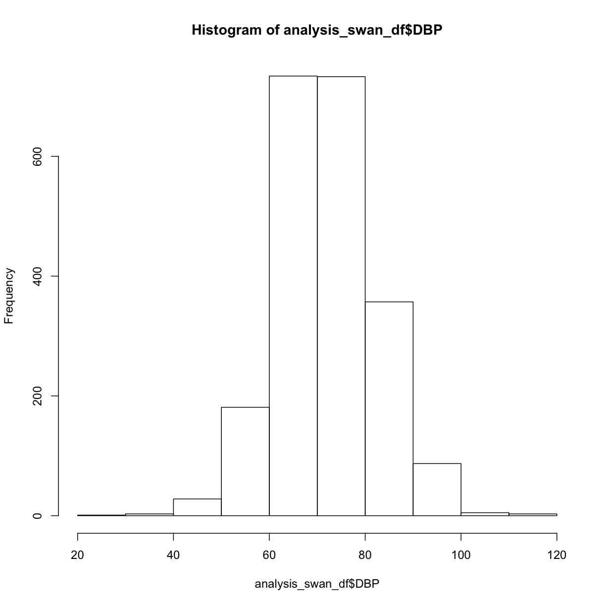
A basic histogram, created with hist() with no optional parameters, gives us a starting point:
hist(analysis_swan_df$DBP)
What are some of the parameters we can control? We can learn more about hist() either by typing ?hist at the Console, or by searching for it using the search bar in the Help pane.
The help documentation includes a “default” method that shows not only the possible parameters we might use, but also their default values if we don’t override them:
## Default S3 method:
hist(x, breaks = "Sturges",
     freq = NULL, probability = !freq,
     include.lowest = TRUE, right = TRUE,
     density = NULL, angle = 45, col = NULL, border = NULL,
     main = paste("Histogram of" , xname),
     xlim = range(breaks), ylim = NULL,
     xlab = xname, ylab,
     axes = TRUE, plot = TRUE, labels = FALSE,
     nclass = NULL, warn.unused = TRUE, ...)
We can read further to learn about how to use each of the parameters. For example, if we wanted to control the breakpoints between the bins, we can specify a value for the breaks parameter:
breaks    one of:

          * a vector giving the breakpoints between histogram cells,
          * a function to compute the vector of breakpoints,
          * a single number giving the number of cells for the histogram,
          * a character string naming an algorithm to compute the number of cells (see ‘Details’),
          * a function to compute the number of cells.
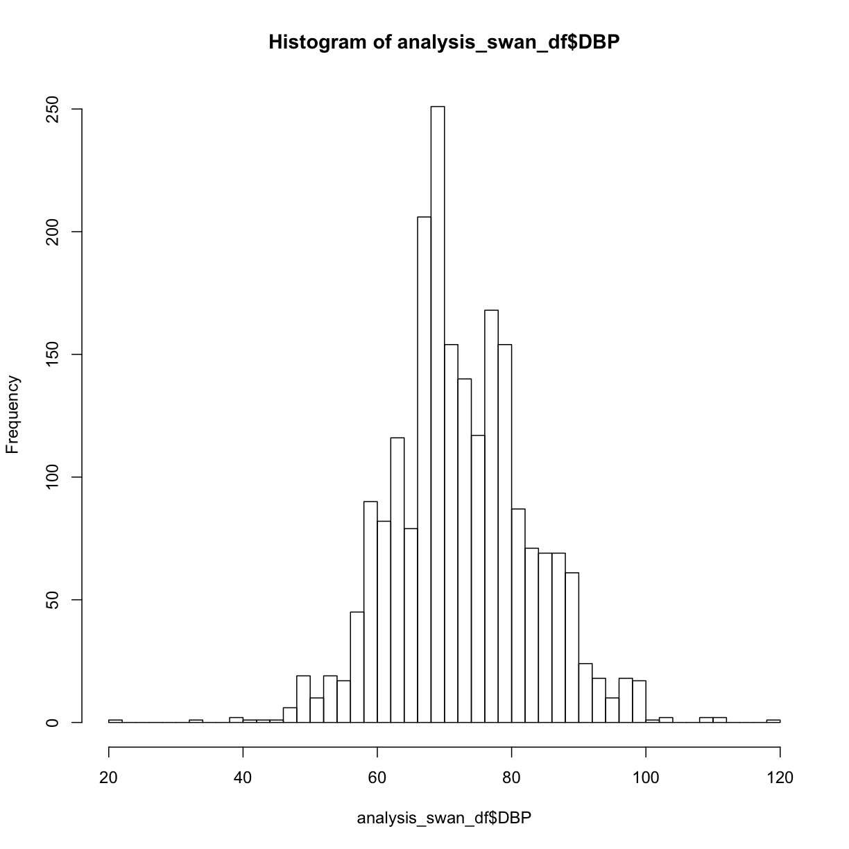
Let’s try passing hist() a single number giving the number of cells or bins:
hist(analysis_swan_df$DBP, breaks = 50)
Exercise
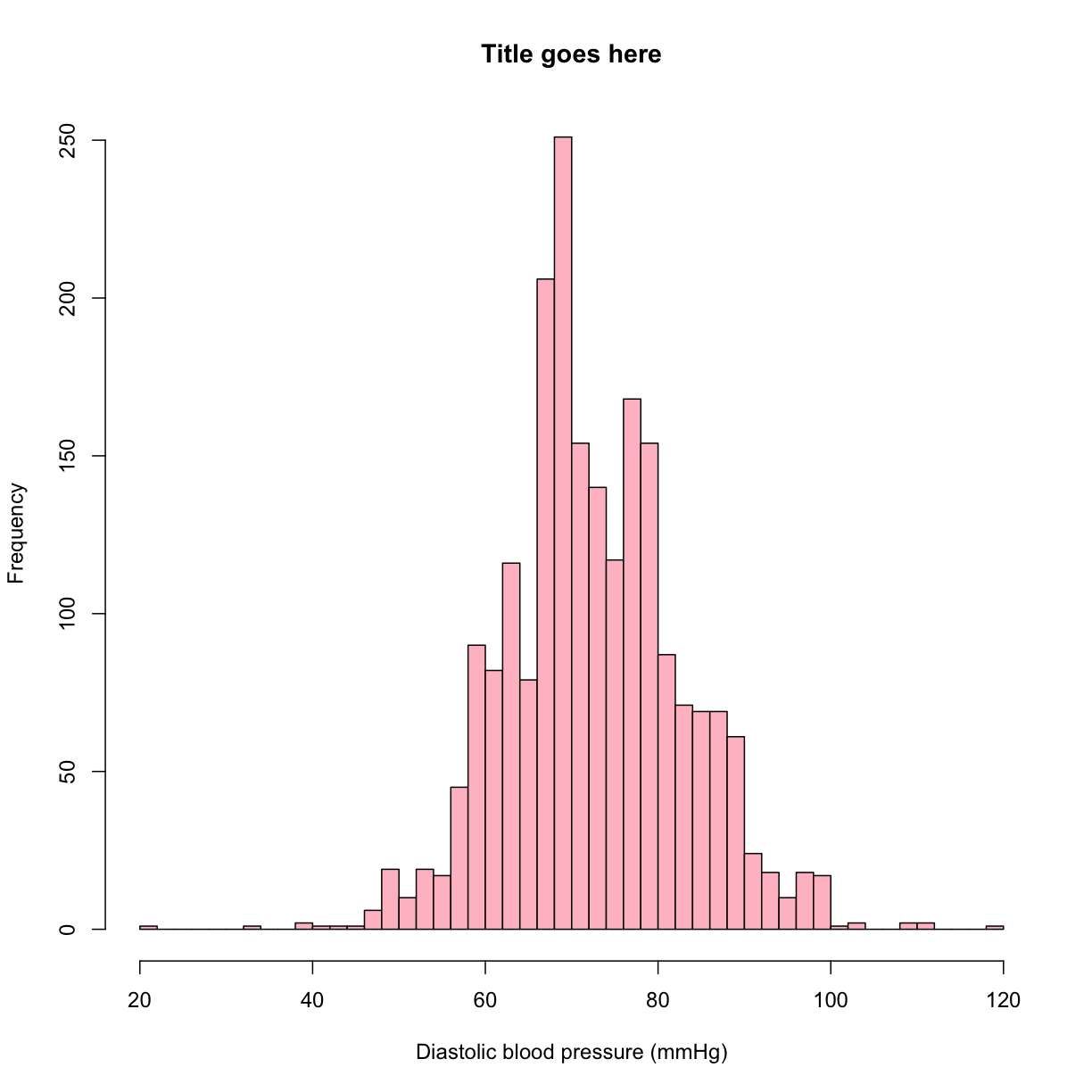
Try adding a main title, and X and Y axis titles to the histogram above.
Try filling the bars with a color.
Solution
hist(analysis_swan_df$DBP, breaks = 50, main = 'Title goes here',
     xlab = 'Diastolic blood pressure (mmHg)', ylab = 'Frequency',
     col = 'pink')
Boxplots
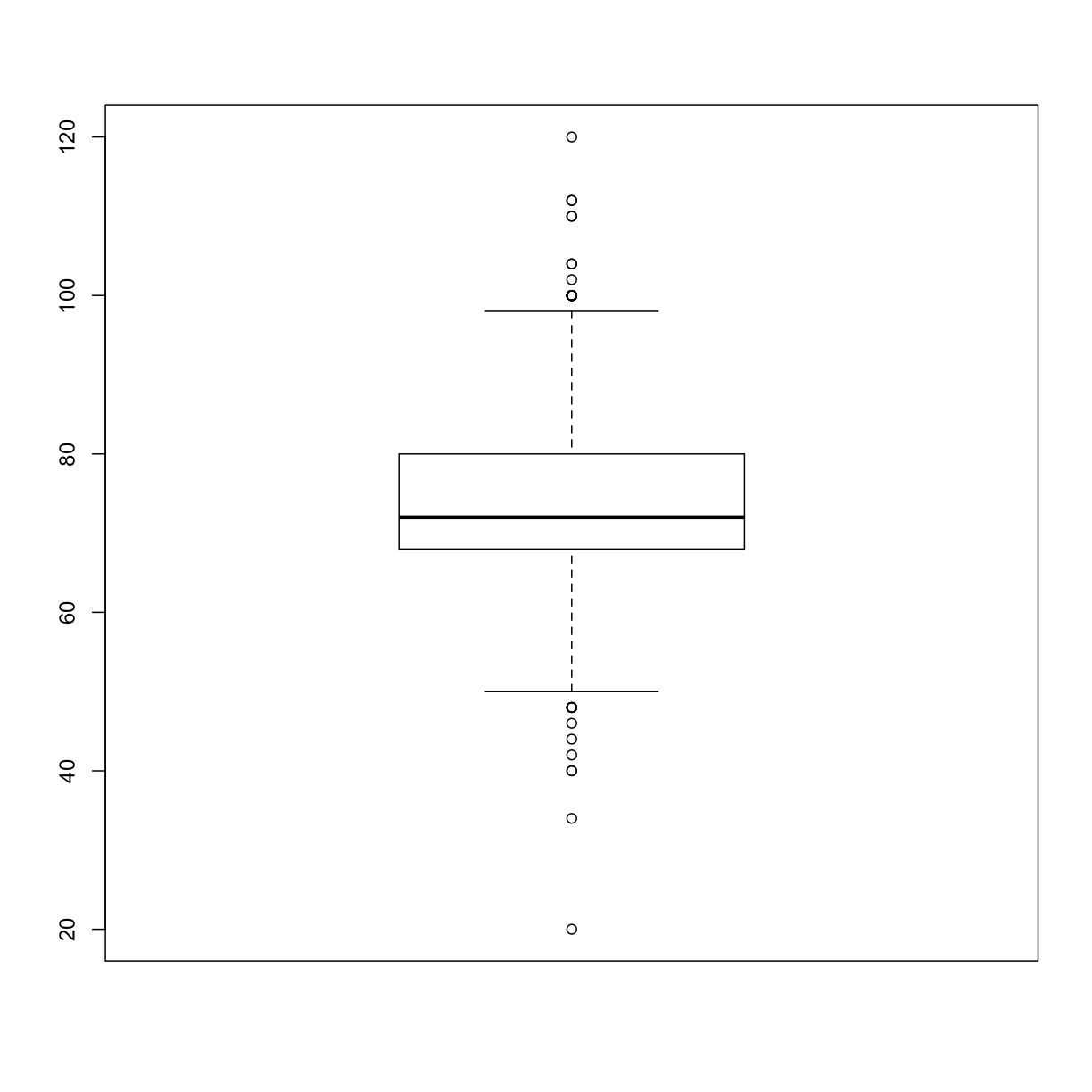
A different way to look at the distribution of values in a variable is a boxplot. Boxplots are one of the best visualizations for identifying outliers. A boxplot shows the minimum value, lower quartile (25th percentile), median (50th percentile), upper quartile (75th percentile), and maximum value. Identifying outliers is important because you want to avoid claiming an association that is only due to the presence of outliers in the data.
We can use the boxplot() function for a quick boxplot.
boxplot(analysis_swan_df$DBP)
Plotting the relationship between two continuous variables
We would now like to verify that any relationship between each X and Y is roughly linear. We can use the plot() function in R to create a scatterplot.
plot(y = analysis_swan_df$Glucose, x = analysis_swan_df$BMI)
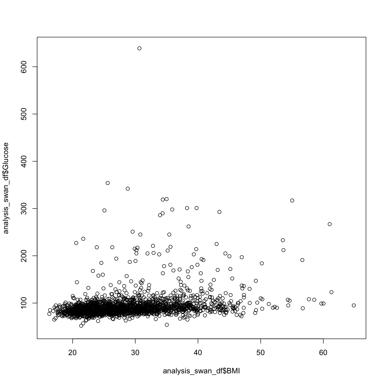
In this case, we see there may be some outliers where Glucose levels are high. Given that a glucose level of over 126 mg/dL is considered Type II Diabetic, we can take a look at the scatterplot with those data excluded.
We’ll make a new data frame from a subset, then redraw the scatterplot:
TODO: Introduce ggplot
library(ggplot2)
analysis_swan_df %>% filter(Glucose<126) %>% ggplot(aes(x=BMI, y=Glucose)) +
    geom_point()
Warning: Removed 44 rows containing missing values (geom_point).
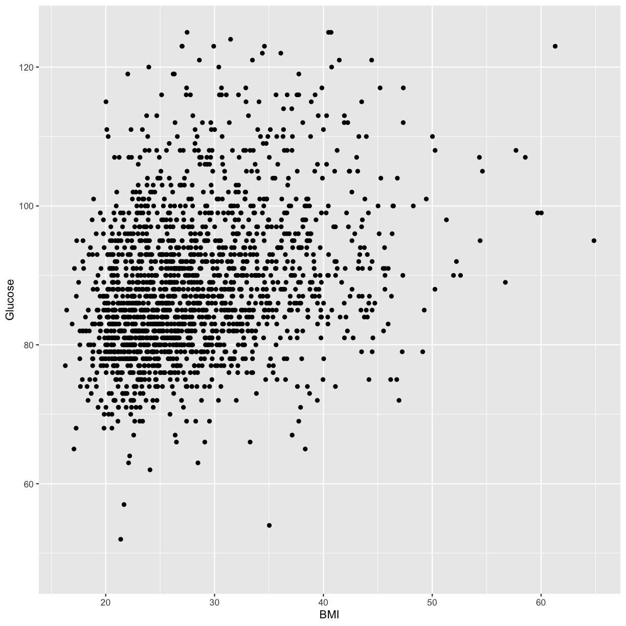
What we’re looking at here is the relationship between BMI and Glucose for subjects with normal (non-diabetic) glucose levels. Although it might not be obvious to the naked eye, there is an overall upward trend and it is reasonably possible that there might be a linear relationship between BMI and Glucose in this data.
Exercise
Create the following to check linear regression assumptions between CRP and Glucose:
- A histogram of CRP values
- A boxplot of CRP values
Solution
hist(analysis_swan_df$CRP, breaks = 50)
boxplot(analysis_swan_df$CRP)
We notice here that the distribution definitely does not look like a normal distribution. However, we might be able to apply a transformation to the data that would result in a variable that does look more normally distributed. Based on the shape of the distribution that we see, we decide to first try applying a log transformation.
Variable transformations
We need to make a new variable in our data frame that is calculated from the values in the CRP variable.
You might remember back in Episode 3, we were able to create a new vector like this:
vec1 <- c(1, 2, 3)
vec1 * 3
[1] 3 6 9
Applying the same concept, we’ll create a new variable in our analysis_swan_df data frame that will be the log() of each value in analysis_swan_df$CRP. We’ll call the new variable log_CRP:
analysis_swan_df$log_CRP <- log(analysis_swan_df$CRP)
Now let’s create a histogram of log_CRP:
hist(analysis_swan_df$log_CRP, breaks = 50)
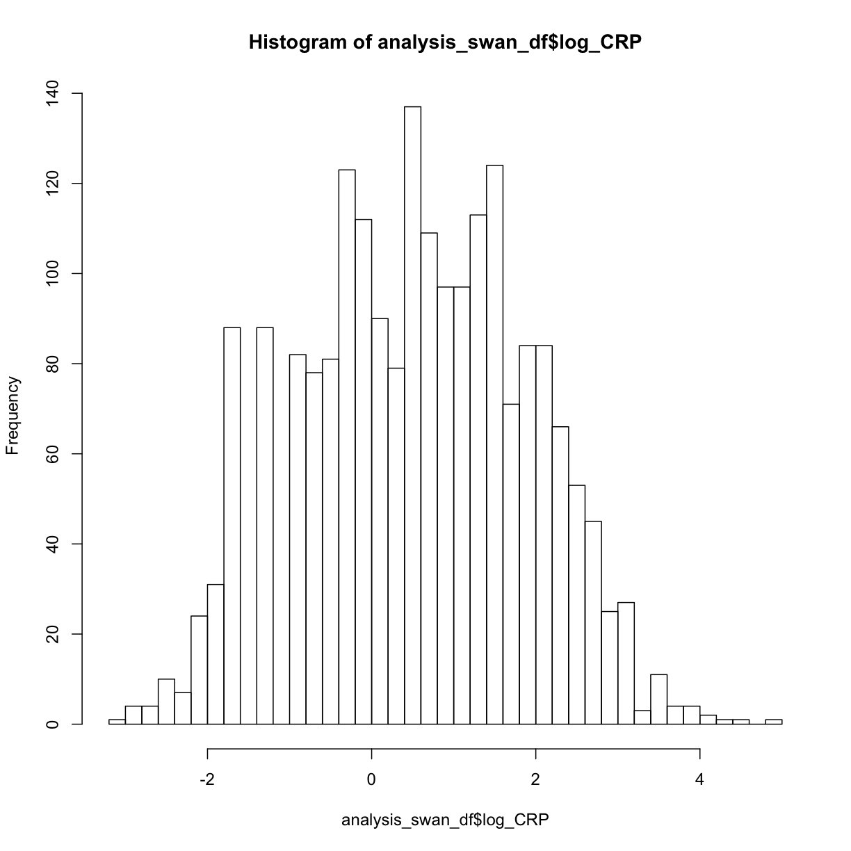
As we see that log_CRP does appear to have more of normal distribution, we can consider using this variable in our regression instead of CRP. Let’s continue checking our assumptions using log_CRP:
Next we can try a scatterplot of log_CRP versus Glucose:
plot(y = analysis_swan_df$Glucose, x = analysis_swan_df$log_CRP)
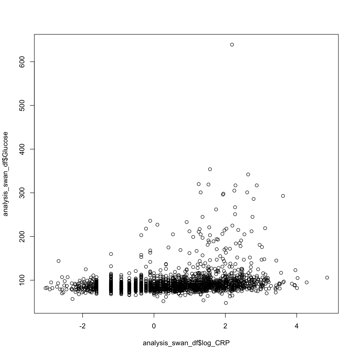
We see again that the Glucose values in the diabetic range may be problematic, so let’s re-make the swan_non_diabetic subset. This time it will have the log_CRP variable as well:
analysis_swan_df %>% filter(Glucose<126) %>% ggplot(aes(x=log_CRP, y=Glucose)) +
    geom_point()
Warning: Removed 5 rows containing missing values (geom_point).

After removing the data with high glucose values, we see that log_CRP could possibly have a linear relationship with Glucose.
Exercise
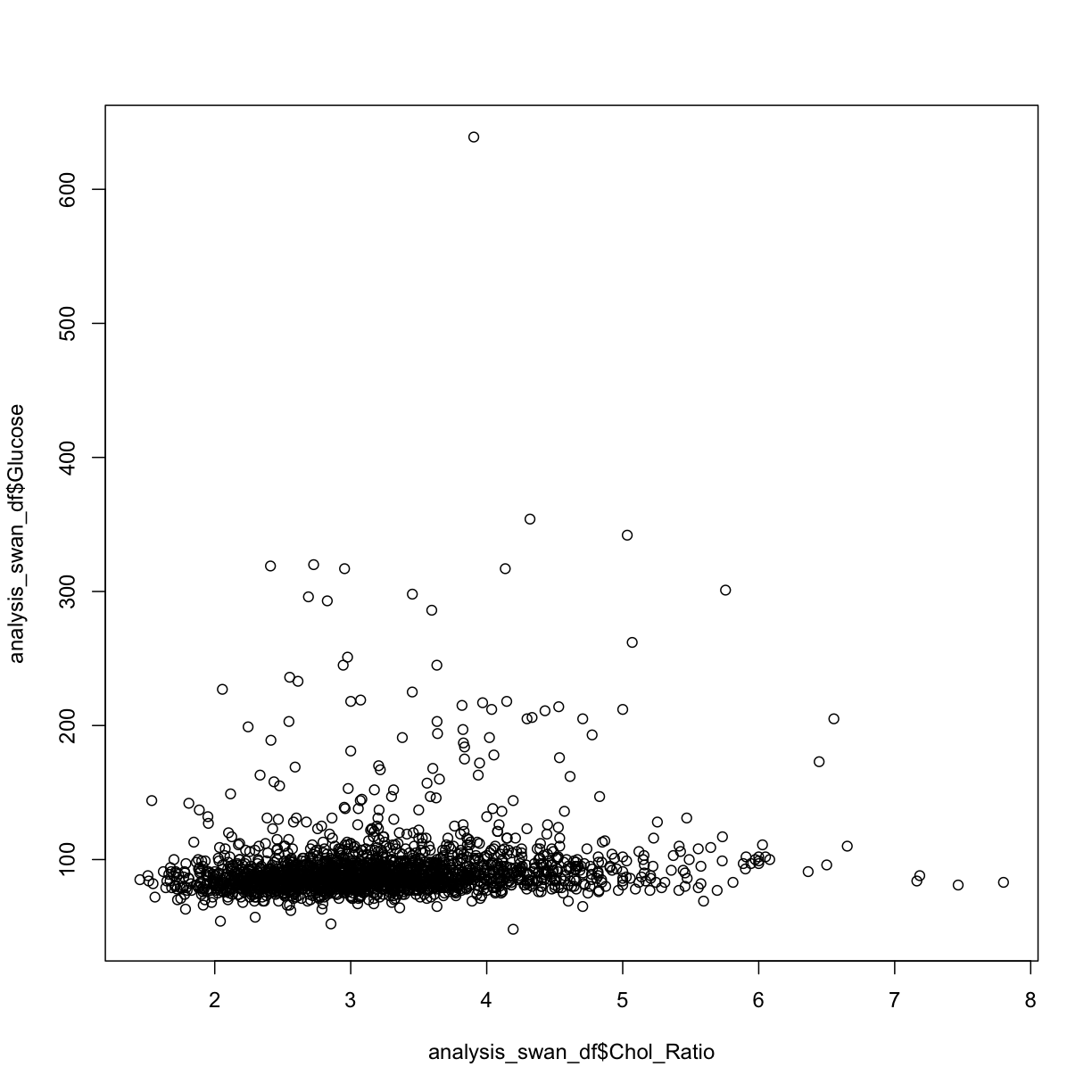
Create a new variable in
analysis_swan_dfthat is the ratio of total cholesterol (HDL + LDL) divided by HDL. Call the new variableChol_RatioSolution
analysis_swan_df$Chol_Ratio <- (analysis_swan_df$HDL + analysis_swan_df$LDL)/analysis_swan_df$HDL
plot(y = analysis_swan_df$Glucose, x = analysis_swan_df$Chol_Ratio)
library(ggplot2)
analysis_swan_df %>% filter(Glucose<126) %>% ggplot(aes(x=Chol_Ratio, y=Glucose)) +
    geom_point()
Warning: Removed 19 rows containing missing values (geom_point).
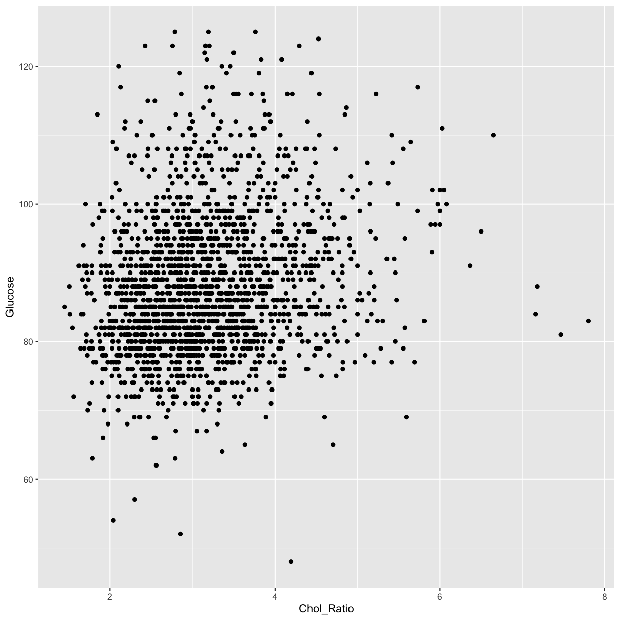
Again, we can see that there is a possible linear trend between the predictor Chol_Ratio variable and the outcome Glucose.
Let’s create the same graphs for our last continuous variable Age.
hist(analysis_swan_df$Age)
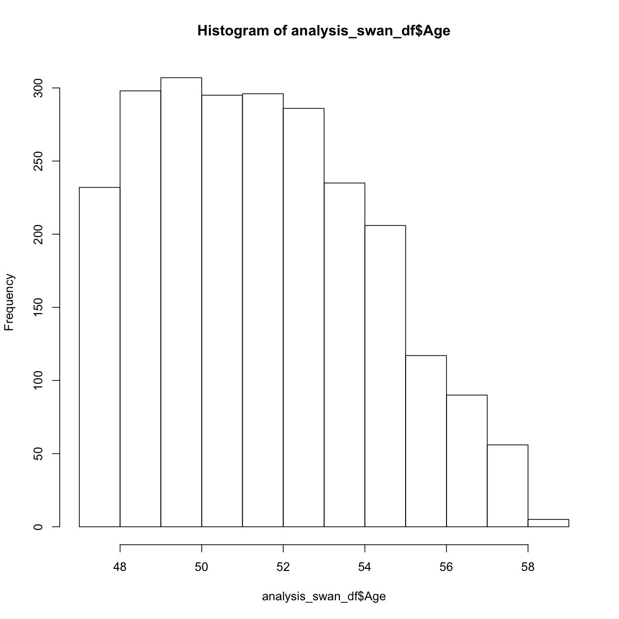 This Swan dataset is unique because the study was designed to understand exposures in women during their early to mid-age. For now, we are going to consider this to be sufficiently normally distributed for our analysis.
Next we can try a scatterplot of Age versus Glucose:
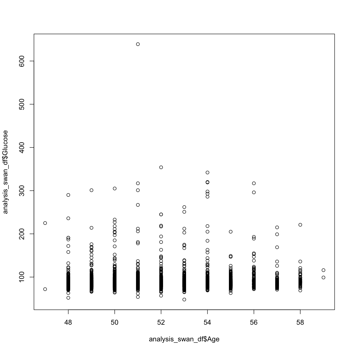
plot(y = analysis_swan_df$Glucose, x = analysis_swan_df$Age)
analysis_swan_df %>% filter(Glucose<126) %>% ggplot(aes(x=Age, y=Glucose)) +
    geom_point()
Warning: Removed 1 rows containing missing values (geom_point).

We may not be sure what to make of it but Age variable is often a confounder. A lot of chronic illnesses come with age so we want to make sure we assess this variable in our multivariate analysis.
Now, that we have looked at the normality and linearity assumputions, let’s proceed to the next episode.
#TODO (maybe): Looking for null values some basic filtering - for example, filter just to women of childbearing age, check for % of NA to pregnancy question Data cleanliness - boxplots, look for outliers
Key Points
Use
hist()to view a histogramUse
boxplot()Use
plot()to create an X-Y scatterplot
